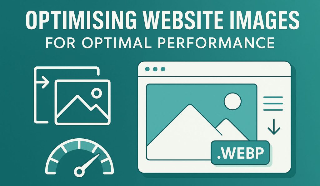
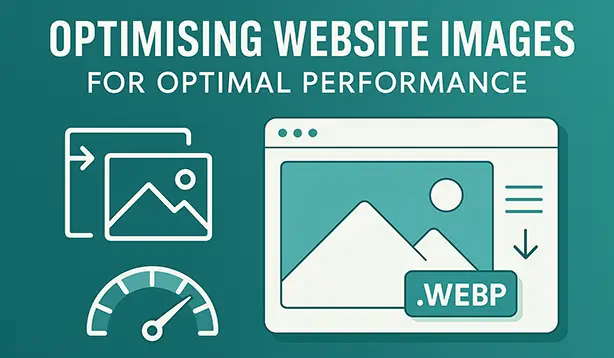
Why images matter more than you think
When I speak to business owners about their websites, one problem comes up over and over again:
“My site feels slow. People say it takes too long to load.”
They’re often worried it means a full rebuild or expensive new hosting. But in my 15+ years of fixing WordPress sites, the culprit is usually far simpler: the images are too big, too heavy, or saved in the wrong way.
Think of it like posting a parcel. You wouldn’t send a fridge-sized box if all you needed to deliver was a single book. But many websites do exactly that: they load massive, oversized images when only small ones are needed.
The result? Visitors wait. Google marks your site down. And people click away before you’ve even had the chance to show them what you do.
The good news is: optimising your images is one of the easiest, most powerful changes you can make. You don’t need a developer’s brain to understand it – just a few simple rules and examples.
Step 1 – Get image sizing right (the “shop window” rule)
Imagine your website is a shop window. You’ve got a display shelf that’s 30cm wide. Would you try to squeeze in a 2-metre poster? Of course not. But that’s what many websites do every day: they load a 2000-pixel wide photo into a space that only shows 320 pixels.
All that extra size is wasted. The visitor’s browser still has to download the whole image, even though it only displays a much smaller version. That slows everything down.
A real-world example
I recently worked with a client who had a three-column blog grid. Each blog post in the grid was around 320px wide. But the site was loading the full-size 2000px image for every post!
Below is an example of an unoptimised JPEG image, compared to an optimised WEBP image:
Optimised from 148KB down to just 15.1KB! That’s a 90% saving – with no visible difference to the eye. Multiply that across 12 posts on the homepage, and you can see why things felt sluggish.
The good news: WordPress helps
When you upload a photo to WordPress, it automatically creates smaller versions for you – like printing a poster, a flyer, and a postcard all at once. These “extra copies” are called image sizes.
For example:
- Thumbnail (150px) – tiny version for grids
- Medium (300–768px) – good for blog images
- Large (1024px) – suitable for main content
- Full size – the original you uploaded
Themes and plugins often add their own. For example, WooCommerce uses:
shop_catalog(for product grids)shop_single(for product detail pages)shop_thumbnail(for small thumbnails)
The trick is making sure your website actually uses these smaller sizes in the right places. If your blog grid only needs 320px, tell WordPress to use the medium version, not the full one.
How big should uploads be?
- Regular content images: 1280–1600px wide
- Blog grid / small cards: 640–960px wide
- Hero banners / full-width sliders: 1600–1920px wide
Anything larger than 1920px is usually overkill, unless you specifically need zoom features or ultra-high-resolution galleries.
Step 2 – Choose the right image format (the “luggage” rule)
Think of image formats like types of luggage. They all carry your stuff, but some are lighter and more practical than others.
- WebP = a modern, lightweight suitcase. Supported by almost all browsers. Best default choice.
- AVIF = an even lighter suitcase, but not quite supported in all browsers yet. Brilliant if your site can provide a fallback.
- JPEG = the old faithful suitcase. Bigger, but still works.
- PNG = a hard case, great for keeping things sharp (like logos or text graphics).
- SVG = a foldable bag. Perfect for logos and icons because it never loses quality.
What to use where
- Photographs: WebP (quality around 75–80).
- Logos & icons: SVG (or PNG if SVG isn’t supported).
- Screenshots / text-heavy images: Lossless WebP or PNG (choose whichever keeps text sharp).
- Animations: replace GIFs with short MP4 or WebM videos. They load faster and look smoother.
Example savings
- JPEG (full-size photo, 1,920px wide): 1.2MB
- WebP version (same dimensions, quality 80): 320KB
- AVIF version (same dimensions): 220KB
That’s a huge saving for something that looks almost identical.
Step 3 – Focus on your most important image (LCP)
Google tracks something called Largest Contentful Paint (LCP). In plain English, it measures how quickly the biggest, most important thing on your page shows up.
Usually, that’s your hero image – the large banner photo at the top of your homepage.
If this image is delayed, Google thinks your whole site is slow. That hurts your Core Web Vitals and search rankings.
How to fix it
- Don’t “lazy-load” your hero image. It should load immediately.
- Tell the browser it’s important: add
fetchpriority="high". - Preload it if possible – this means “download this image first, it’s essential.”
- Make sure it’s sized correctly. Don’t use a 4000px photo if 1600px would do.
On WordPress, you don’t need to hand-code this. There are free plugins (like Preload LCP Image) that let you set your key image per page.
Step 4 – Compression and “noisy” images
Not all photos are created equal. Some compress down really small. Others stubbornly stay large.
That’s because of “noise” and all of the tiny details, textures, and colour changes in an image. Think of:
- Leaves on a tree
- Fireworks in the sky
- A glittery dress
These are hard for computers to simplify, so the files stay bigger.
By contrast, clean images with simple backgrounds compress beautifully.
Practical tips
- Start with quality 80 when saving in WebP.
- If you can’t see a difference, try 75 or 70 – the file will shrink further.
- If the photo is “noisy”, try a quick denoise filter in your editor first.
- For screenshots, use PNG or lossless WebP to keep text sharp.
Example
- Busy fireworks photo (1920px):
- JPEG: 2.4MB
- WebP at quality 80: 1.1MB
- Clean product shot with white background (1920px):
- JPEG: 1.1MB
- WebP at quality 80: 240KB
Same dimensions, but wildly different file sizes.
Step 5 – Lazy-load everything else (the “restaurant” rule)
Imagine sitting down in a restaurant. Instead of bringing your starter, the waiter brings every single dish on the menu to your table at once. You’d wait forever, and the table would be chaos.
That’s what happens when a website tries to load every single image at the start – even the ones halfway down the page.
The fix is simple: lazy-load images that are below the fold. This means they only load when the visitor scrolls near them.
Most modern browsers (and WordPress itself) support this out of the box.
The only exception? Your hero/LCP image. That should load immediately, as explained in Step 3.
Step 6 – Background images vs normal images
Designers love background images – they look neat and are easy to place. But browsers can’t handle them as smartly as normal <img> tags.
If an image is content (like a hero banner, product photo, or featured image), always use <img>. This lets the browser:
- Pick the right size (from WordPress’ smaller versions)
- Lazy-load correctly
- Preload or prioritise if needed
Save background images for decoration only.
Step 7 – Quick checklist (your “to-do” list)
- Upload images no larger than 1920px wide (unless you need zoom).
- Use WebP format where possible.
- Make sure your hero image loads first (no lazy-load, add priority).
- Lazy-load everything else further down the page.
- Choose clean, simple photos if you can – they compress better.
- Double-check your blog/product grids are pulling the right smaller sizes.
Common mistakes to avoid
- Uploading photos straight from your phone or camera (5–10MB each).
- Using background images for critical content.
- Lazy-loading your main banner or hero.
- Sticking with JPEGs out of habit. WebP is faster and almost universally supported.
Why this matters to your business
This isn’t just about nerdy speed scores. It’s about business impact.
- Google rankings – Google openly rewards faster sites.
- Conversions – studies show a 1-second delay can cut conversions by up to 7%.
- First impressions – nobody waits around for a slow-loading site.
For many of my clients, simple image fixes alone have cut load times by half. No redesign. No expensive hosting. Just smart, lighter images.
Final thoughts
Getting your website’s images right is one of the simplest, highest-return improvements you can make. It’s not about trickery – it’s about respecting your visitors’ time and making sure your site feels smooth and professional.
If you’d rather not spend your evenings resizing and converting photos, I can help. My WordPress speed optimisation service is designed to take this off your plate, show you clear before-and-after results, and keep your site in top shape. You can also book a free consultation if you’d like to chat it through first.
What about you? Have you struggled with slow-loading images or found a trick that works well on your own site? I’d love to hear your experiences. Drop a comment below and share the challenges you’ve faced (or the wins you’ve had) when it comes to website images – your feedback not only helps others, it also gives me insight into what business owners find most useful.
0 Comments