I recently took the plunge and decided to start building sites with Bricks Builder – and honestly, I wish I’d done it sooner. After years of working with other page builders like Elementor and Divi, Bricks feels like a breath of fresh air. It’s fast, flexible, and powerful right out of the box. No bloat, no hacks – just clean, logical building blocks and a genuinely enjoyable UI.
But of course, no tool is perfect.
Why I’m Switching to Bricks Builder
Let’s get this out of the way: Bricks Builder is an absolute game-changer for WordPress developers. Unlike Elementor or Divi, it’s not weighed down with unnecessary fluff or constant upsells. It gives you more flexibility and control without needing a pile of add-ons, and makes it easy to build complex, custom websites with performance in mind.
That said, while it’s miles ahead in many ways, it’s still under active development – and that sometimes means the odd rough edge.
The ‘Nav (Nested)’ Menu Alignment Problem
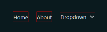
Setting up my first site, I dropped in the Nav (Nested) element to build out a header. Pretty straightforward – until I previewed it. Immediately, I noticed something off: the Nav Link items and the Dropdown menu item weren’t aligning correctly.
The Nav Link text sat slightly lower than the Dropdown link, just enough to look off. It’s a minor visual bug, but for anyone with an eye for detail, it stands out like a sore thumb.
Here’s a couple of screenshots (Red underline to emphasise the alignment):

Digging Into the CSS: What’s Causing It?
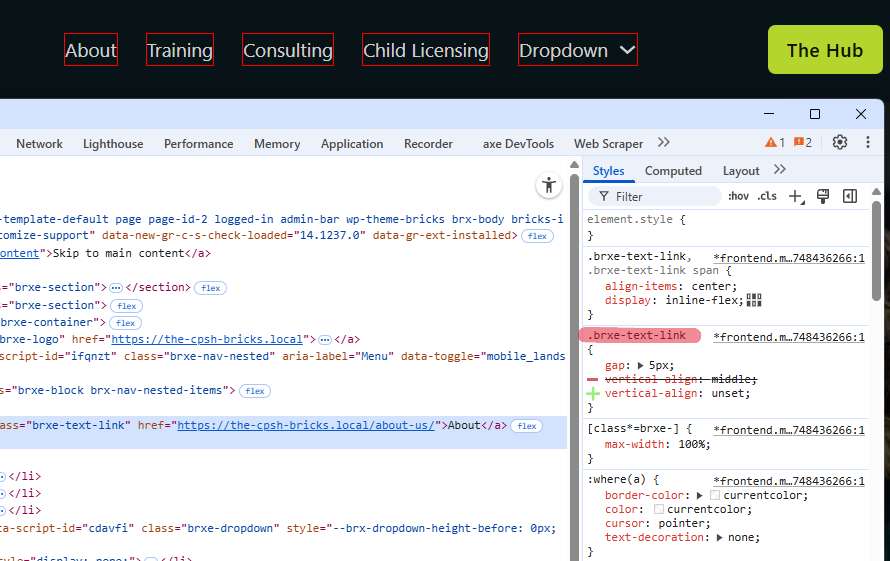
I popped open Chrome’s developer tools to take a closer look. After poking around a bit, I found the likely culprit: the .brxe-text-link class had a vertical-align: middle; rule applied to it.
This rule seems to affect the alignment of regular nav links – but oddly, not the Dropdown item, which sits slightly higher. My guess? It’s been “fixed” by other developers by fudging things with padding or a specific layout tweak, rather than addressing the actual cause.
The Simple CSS Fix (That Works)
To fix the issue cleanly, I removed the vertical alignment from .brxe-text-link. This brings the links back into proper alignment:
.brxe-text-link {
  vertical-align: unset;
}
The Result
Perfectly aligned menu items…
I’ll be testing this across a few more installs to be safe, but so far it looks like a clean fix – better than just masking/hiding the underlying problem with padding. I’ll likely drop this into my child theme so it stays put.
Final Thoughts
Despite this minor Bricks Menu Alignment issue with the Nav (Nested) element, I’m still seriously impressed with Bricks. It’s by far the best builder I’ve worked with – fast, lean, and built for developers who want real control without all the noise.
No doubt this little bug will get addressed in a future update. But it’s also a good reminder: even the best tools have quirks. The difference with Bricks is that it gives you the tools to solve them quickly, without fighting the builder.
Have you run into this or any other Bricks Builder issues? Drop a comment below – or get in touch if you’re after a custom Bricks site built the right way.
0 Comments